Excel Example
Histogram
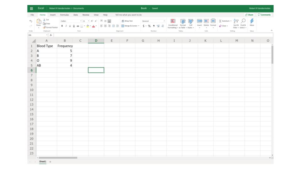
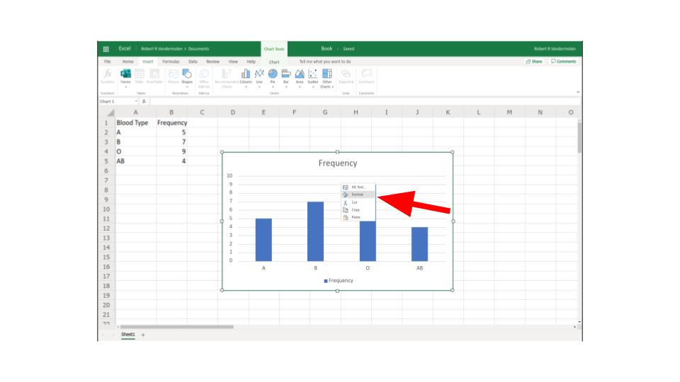
Step 1: Enter your frequency table into Excel by writing a column for your classes and a column for your frequencies.
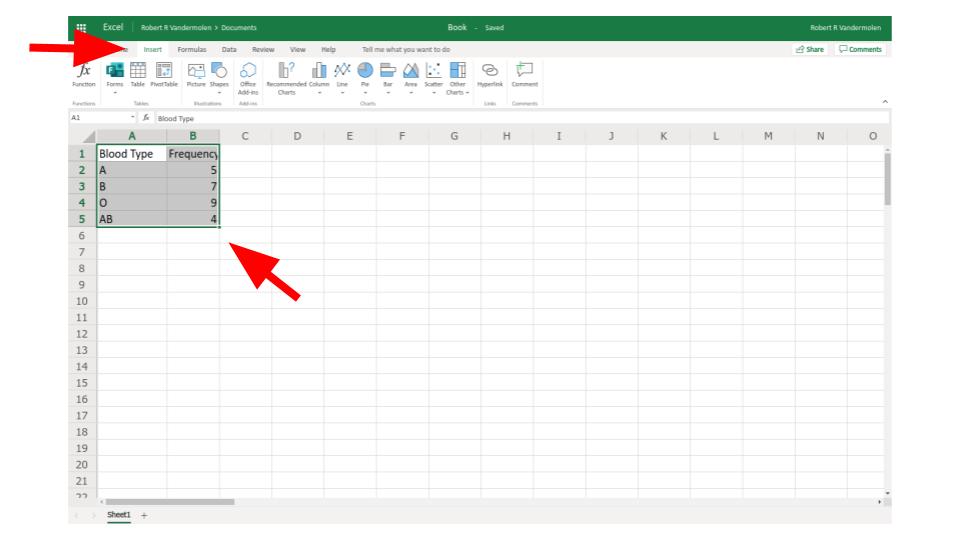
Step 2: Click "insert" in the top menu options then select the desired cells by clicking the mouse and dragging
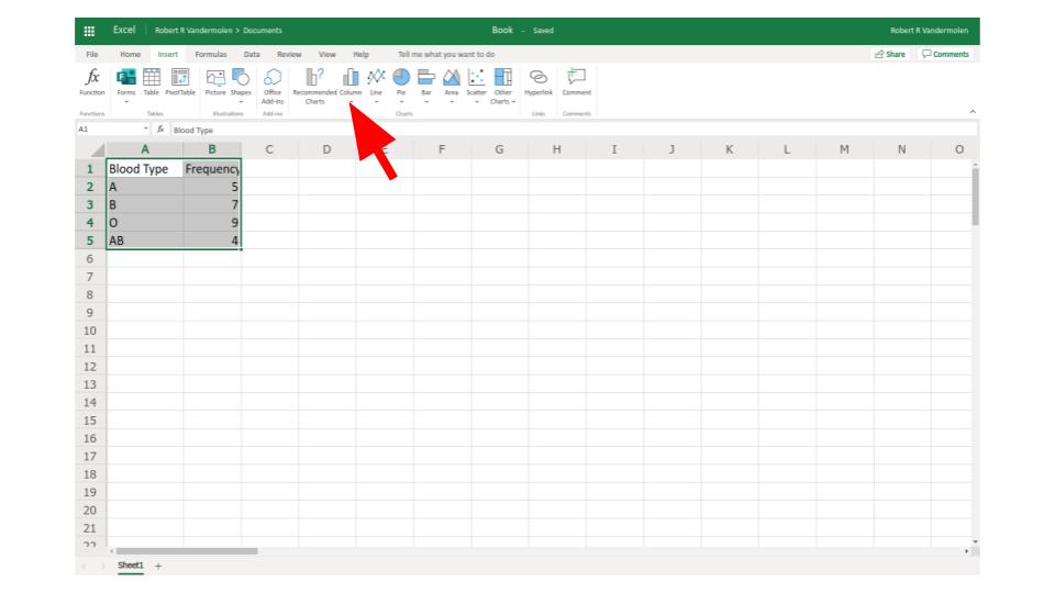
Step 3: Select the option "column" from top menu
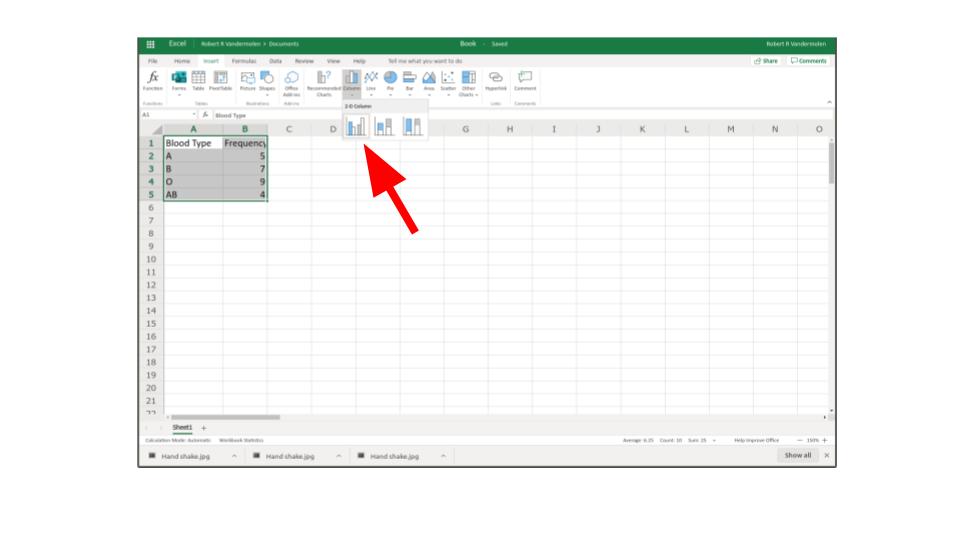
Step 4: From dropdown menu select bar graph.
Step 5: Right click graph and choose "format" to change appearance options
To see this done watch the following video: